
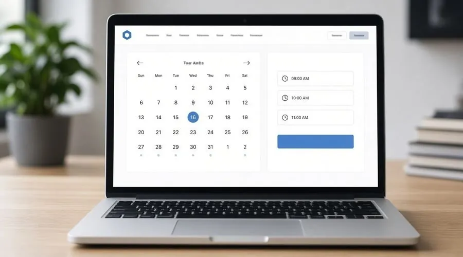
A service page with no form can convert better than one with a long form, but only in specific cases. If your buyers want to talk to a person before deciding, a link to a booking calendar removes the guessing: no waiting for a reply, no back-and-forth about times. If they want a written quote first, a calendar link is the wrong tool.
This piece is about choosing between a calendar link and a contact form on a service page, and how to set up the calendar so it actually produces appointments.
When does a calendar link beat a form on a service page?
It works best when the next step is a conversation and the buyer knows what they want to discuss. Consultants, installers who quote after a site visit, and professional services all fit. The visitor reads the page, decides the offer is relevant, and picks a time on the spot. A form puts a delay between interest and action, and some of the interest fades in that delay.
It works poorly when the visitor is only comparing options. Someone who is three tabs deep in research does not want to commit to a call yet. For them, a short form or a visible phone number is gentler, and a calendar can feel like pressure.
A fair test is to look at your last ten inquiries. If most began with “can we talk” or “when can you come out,” try the calendar. If most began with a question or a request for pricing, keep the form.
How should you set up the calendar so it does not backfire?
Show only slots you can actually keep. An open calendar with dozens of times that you then reschedule defeats the purpose. Set buffers between meetings, a minimum notice period, and a daily cap. Make the time zone obvious, particularly if you serve more than one.
Keep the booking screen short. Name, email, one question that helps you prepare, and a phone number only if you will really call. Each extra field costs bookings. Then check the confirmation: the visitor should immediately get an email with the date, how the meeting will happen and a way to reschedule.
Embedded calendars can be slow on phones. Open the page on a real phone, tap through to a booking and see how long it takes. If it drags, link to the calendar page instead of embedding it. A fast link beats a pretty embed.
What should the page say around the calendar?
Say what the call is and what happens afterward. “Book a 20-minute call to talk through your site and decide whether an audit makes sense” is a promise the visitor can judge. “Book now” is not. Tell them what to prepare, how long it takes and what you will send afterward.
Keep a fallback for people who do not want a call. A line such as “Prefer to write? Use the contact page” costs nothing and catches the visitors who would otherwise leave. You are not giving up the calendar, just keeping both doors open.
Put the proof near the button, not three screens above it: a short description of the process, what you deliver, and a link to the portfolio. The reader should not have to scroll back up to decide.
How do you tell whether it worked?
Count three things for a month or two: how many visitors reach the booking screen, how many complete a booking, and how many bookings turn into actual meetings. A high number of started bookings with few completed ones points to a clunky screen. Many bookings with many no-shows suggest the page set the wrong expectation, or reminders are missing.
Compare against the form’s results from the same period before the change, and keep notes of when you changed what. Alter one thing at a time. A new headline and a new calendar in the same week tells you nothing.
If the numbers are muddy, your analytics setup may be the cause. A website audit is one way to confirm the booking step is tracked in the first place.
Quick decision guide
- Choose a calendar if buyers want to talk first.
- Choose a form if buyers want a written quote or are still comparing.
- Offer both on higher-value pages and see which gets used.
- Test the booking flow on a phone before you publish.